Track the top 7 Bitcoin macro indicators for 2026, from Global M2 and DXY to ETF flows, Fed policy, and stablecoin liquidity.
Author: Kritika Gupta
A massive knowledge gap still exists between traditional macro analysis and crypto trading. Most crypto content stays confined to on-chain metrics, sentiment, and technical analysis, while much of macro research still overlooks crypto entirely. This article closes that gap by showing active Bitcoin traders exactly which macro indicators move price and, more importantly, why they do
The core shift is simple: Bitcoin has become a macro asset. Since the ETF approvals in January 2024, BTC has responded far more directly to liquidity conditions, Federal Reserve policy, dollar strength, and institutional capital flows than at any earlier stage in its history. If you trade Bitcoin without watching key macro indicators, you are trading with incomplete information
This matters even more in 2026 because the market structure has changed. Bitcoin no longer trades only on crypto-native narratives. It now moves alongside broader risk assets when liquidity expands and weakens when financial conditions tighten. The purpose of this guide is not just to list indicators, but to explain the mechanism behind each one so you understand what is actually driving the move on the chart.
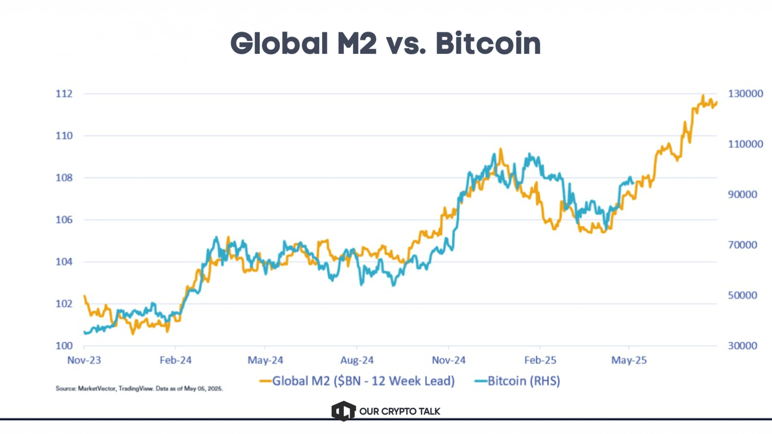
Bitcoin’s historical relationship with Global M2 has approached 90 percent in widely cited macro overlays. That is not a coincidence. Bitcoin absorbs excess liquidity. When central banks expand money supply, BTC usually rises as capital moves out the risk curve. When liquidity tightens, Bitcoin usually weakens first. Too much crypto analysis still underestimates this.
Bitcoin has firmly evolved into a macro-sensitive asset since the spot ETF approvals in January 2024. That approval cycle changed who drives price. Pension funds, hedge funds, family offices, RIAs, and treasury desks now allocate through regulated vehicles, and those flows respond to the same forces that move equities, bonds, and credit markets.
The relationship between Bitcoin and global liquidity makes this impossible to ignore. Historically, Bitcoin’s relationship with Global M2 has approached 90 percent in liquidity overlays used by macro analysts. Bitcoin behaves like a liquidity sponge. When central banks inject fresh money into the system, capital rotates toward higher-beta assets and BTC tends to outperform. When central banks tighten, withdraw liquidity, or keep rates restrictive, Bitcoin often weakens before slower-moving asset classes.
Too much crypto analysis still focuses only on exchange balances, whale wallets, funding rates, and short-term sentiment while ignoring the bigger force that sets direction. If the Fed is tightening and the dollar is strengthening, a bullish on-chain setup can fail quickly. Macro is the tide. On-chain metrics are the boat riding it.
These macro indicators help traders read the tide before it fully shows up on the chart. Together, they help traders read the tide before it fully shows up on the chart.
Relative positioning across key Bitcoin macro indicators in 2026
Global M2 measures the total broad money supply across the world’s major central banks, including the Federal Reserve, the European Central Bank, the Bank of Japan, and the People’s Bank of China. In practical terms, it tells you how much liquid money is circulating through the global financial system.
This is one of the most important macro indicators and the single most important liquidity metric for Bitcoin. The widely cited macro view, often referenced by analysts such as Raoul Pal, is that BTC has shown an approximately 90 percent relationship with global liquidity when measured through a custom Global M2 composite with an 8 to 12 week lead-lag overlay. The mechanism matters more than the headline correlation. When central banks expand liquidity, capital moves out of cash and low-yield instruments and into risk assets. Equities and growth names usually move first, and Bitcoin often follows as the highest-beta liquid asset in the system.
When liquidity tightens, the reverse usually happens. Risk appetite fades, capital rotates defensive, and BTC often comes under pressure faster than traditional assets. This is why Bitcoin’s strongest rallies, including 2020 to 2021 and late 2024, aligned with expanding liquidity cycles.
As of early 2026, U.S. M2 stands near $22.67 trillion, up from $22.39 trillion in December 2025. Global composite liquidity trackers place Global M2 near $118.2 trillion, which is at or near record highs. That means global liquidity has been expanding since late 2025, which historically supports Bitcoin as long as the dollar and Fed policy do not move sharply against it.
Where to track: FRED, TradingView using M2SL for the U.S. component, and Global M2 composite charts from analysts such as @RaoulGMI on X.
The DXY measures the U.S. dollar against a basket of six major currencies: the euro, Japanese yen, British pound, Canadian dollar, Swedish krona, and Swiss franc. When the index rises, the dollar strengthens. When it falls, the dollar weakens.
Among the most closely watched macro indicators, Bitcoin usually performs best when the dollar weakens and global financial conditions ease. The mechanism goes beyond a simple inverse chart relationship. A stronger dollar tightens global liquidity, makes dollar-denominated assets more expensive for international buyers, and pushes capital toward cash and defensive assets such as Treasuries. That reduces appetite for higher-beta assets like Bitcoin.
A stronger dollar also pressures emerging markets by increasing dollar funding costs and weakening local currencies. That often reduces speculative capital flows into global risk assets. When the dollar weakens, that pressure eases and capital can rotate into alternative stores of value, including BTC.
As of early April 2026, the DXY is trading around 100.0, oscillating in the 99 to 100 zone after rebounding from late-January lows near 95.5. A sustained move below the 98 to 99 range would historically improve the backdrop for Bitcoin by easing dollar strength and supporting global liquidity.
Where to track: TradingView with ticker DXY, FRED, and Bloomberg.
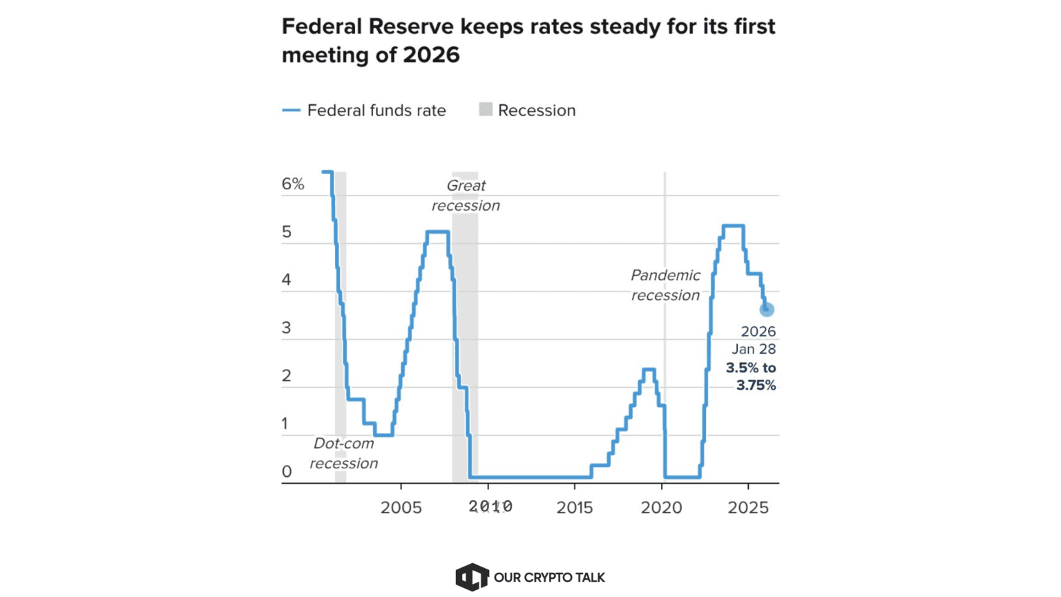
This indicator tracks the Fed Funds Rate and the Federal Reserve’s balance sheet policy. The Fed Funds Rate sets the cost of short-term borrowing in the U.S. financial system, while Quantitative Tightening reduces liquidity by shrinking the Fed’s balance sheet and Quantitative Easing adds liquidity by expanding it.
Federal Reserve policy affects Bitcoin directly through the liquidity channel. Lower rates reduce the yield advantage of cash and Treasuries, support borrowing and credit creation, and encourage capital to move into risk assets. That tends to help Bitcoin. Higher rates do the opposite by tightening financial conditions and raising the hurdle for speculative assets.
QT also matters because it directly removes liquidity from the system. Bitcoin’s strongest rallies, including 2020 to 2021 and parts of late 2024, aligned with easy monetary conditions. Its deepest drawdown in 2022 aligned with aggressive tightening.
The Fed Funds Rate currently sits in the 3.50 percent to 3.75 percent target range. The Fed’s balance sheet stands near $6.68 trillion as of April 1, 2026, which suggests QT has slowed materially from the aggressive runoff phase of 2022 to 2024. Markets are pricing a high probability of no immediate change and roughly one cut by year-end 2026.
Where to track: CME FedWatch Tool, FRED for balance sheet data, and the Federal Reserve’s FOMC schedule.
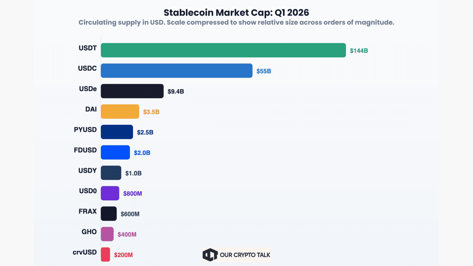
Stablecoin total supply measures the combined market cap of on-chain dollar-pegged assets such as USDT, USDC, DAI, and PYUSD. It shows how much deployable capital is already sitting inside the crypto ecosystem.
This is the crypto-native liquidity signal that most traditional macro frameworks miss. When stablecoin supply grows, it often means fresh capital is entering crypto even before it buys BTC. That capital often acts as dry powder during pullbacks and supports the next move higher.
When stablecoin supply contracts, capital is leaving the ecosystem, which reduces buying power and weakens overall risk appetite. This is one of the clearest bridges between macro liquidity and on-chain positioning.
As of early April 2026, total stablecoin market cap stands at about $317.2 billion, marking a fresh all-time high. Supply has grown roughly 1.4 percent over the last 30 days, signaling that significant capital remains positioned inside crypto and available for deployment.
Where to track: DeFiLlama’s Stablecoins dashboard, CoinGecko, and DeBank.
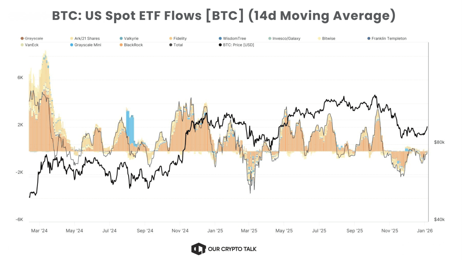
Bitcoin ETF net flows measure daily inflows and outflows across U.S. spot Bitcoin ETFs such as IBIT, FBTC, and ARKB. Positive net flows show that institutions are allocating more capital into BTC than they are withdrawing.
This is the cleanest post-2024 measure of direct institutional demand. Unlike exchange wallet flows or whale tracking, ETF flow data captures actual TradFi buying through regulated products. When inflows remain positive, institutions provide a structural bid under Bitcoin’s price. When outflows accelerate, institutions reduce exposure, take profits, or respond to a more cautious macro environment.
As of early April 2026, March recorded about $1.32 billion in inflows, while Farside’s cumulative data shows IBIT leading with about $63.1 billion in lifetime net inflows, followed by FBTC with about $10.97 billion.
Where to track: Farside Investors, Coinglass, and Bloomberg Terminal.
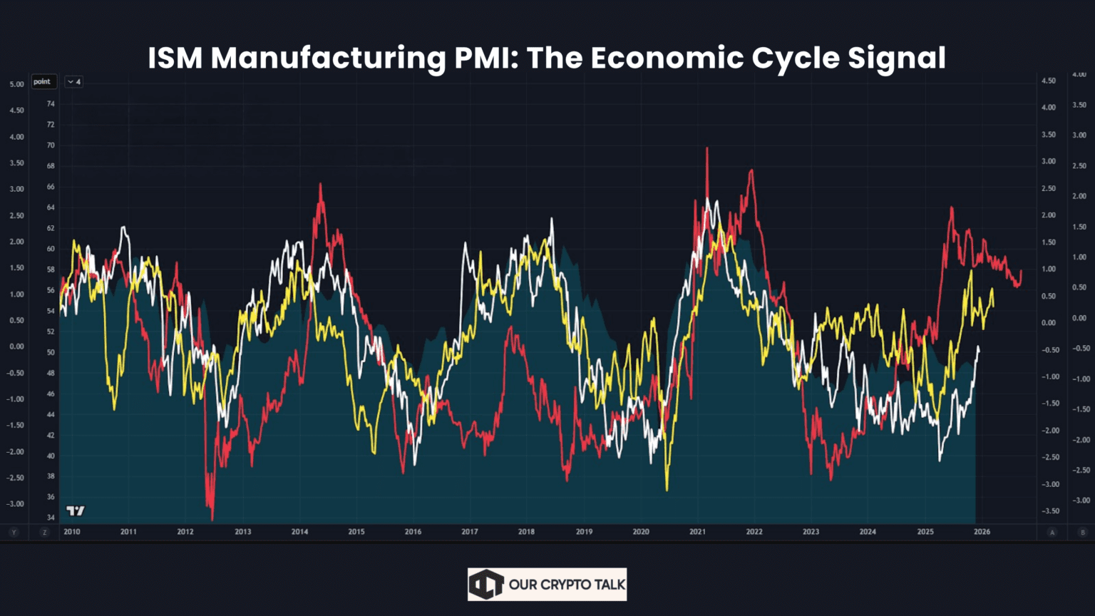
The ISM Manufacturing PMI is one of the most useful macro indicators for active Bitcoin traders because it gives an early read on where the real economy is heading. Published monthly by the Institute for Supply Management, it surveys purchasing managers across U.S. manufacturing businesses and converts that data into a diffusion index. A reading above 50 signals expansion in manufacturing activity, while a reading below 50 signals contraction.
For a Bitcoin trader, the value of PMI is not just the number itself, but what it tells you about market regime and future policy expectations. When PMI stays above 50, markets usually interpret that as continued economic expansion, stronger corporate demand, and healthier risk sentiment across financial markets. In that environment, capital generally remains comfortable taking exposure to higher-beta assets, which tends to support BTC.
The mechanism becomes even more important when you connect PMI to Federal Reserve expectations. A stronger PMI usually reduces immediate expectations for aggressive rate cuts because the economy is still showing resilience. That can initially support risk sentiment, but if growth remains too strong alongside sticky inflation, markets may begin pricing a more restrictive Fed path. On the other hand, when PMI drops below 50, recession fears usually rise quickly. Markets often rotate toward defensive assets, which can pressure Bitcoin in the short term.
The key nuance is what happens next. If the slowdown becomes deep enough to push the Fed toward easing, the setup can flip bullish through the liquidity channel. This is why PMI is one of the most sophisticated indicators on the list: it does not just measure economic activity, it helps traders anticipate the next shift in Fed policy.
As of March 2026, the ISM Manufacturing PMI came in at 52.7, up from 52.4 in February and 52.6 in January. That means the index has now remained above 50 for three consecutive months, signaling a sustained return to manufacturing expansion after the softer conditions seen through much of late 2025.
For Bitcoin, that currently suggests a risk environment that remains broadly supportive, although traders still need to watch whether stronger growth delays expected Fed easing later in the year.
Where to track: ISM’s official website, TradingView, and Bloomberg.
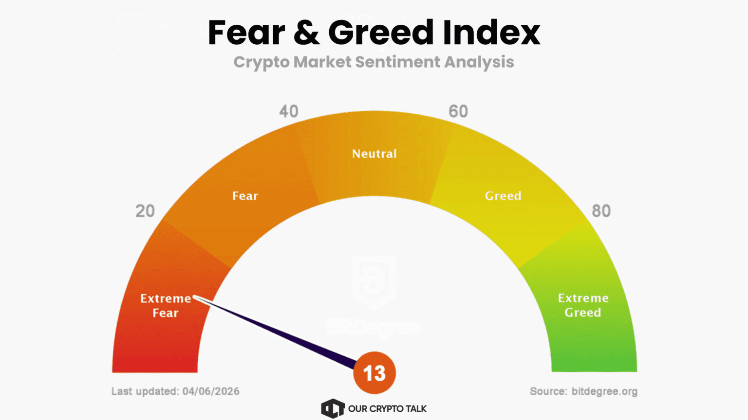
The Crypto Fear & Greed Index is the psychological complement to the six macro indicators above. Unlike M2, DXY, or PMI, this is not a macro fundamental. It does not measure liquidity, growth, or rates. Instead, it measures market emotion. While it is sentiment-driven, it still complements the broader set of macro indicators used in this framework.
The index scores sentiment on a scale from 0 to 100, where 0 represents extreme fear and 100 represents extreme greed. It combines volatility, price momentum, volume, social activity, Bitcoin dominance, and trend signals to estimate whether the market is positioned defensively or euphorically.
Its importance comes from how it works as a contrarian indicator. Historically, readings below 20 have often aligned with strong medium-term buying opportunities because they signal panic, forced selling, and deeply defensive positioning. At these levels, much of the weak-handed capital has already exited. Conversely, readings above 80 often align with late-stage optimism, crowded positioning, and elevated correction risk.
The mechanism here is psychological rather than macroeconomic. Markets tend to overshoot in both directions. Extreme fear usually reflects capitulation, while extreme greed often reflects complacency and excessive leverage. For Bitcoin traders, this helps quantify the classic principle of being cautious when everyone is euphoric and looking for opportunity when panic dominates.
As of now, the index sits at 13, which places the market firmly in Extreme Fear territory. That does not guarantee an immediate reversal, and this is where many traders misuse the signal. Extreme fear can persist for days or even weeks if broader liquidity conditions continue to worsen.
This is why the index should never be used in isolation. It works best as the crowd-psychology overlay on top of the six macro indicators above. If liquidity remains supportive while sentiment stays deeply fearful, that combination has historically produced some of Bitcoin’s strongest risk-reward setups.
Where to track: Alternative.me and Coinglass.
The real edge does not come from tracking macro indicators in isolation. The intellectual advantage comes from understanding how all seven signals interact at the same time. This is what makes the framework unique. Markets rarely move because of one data point alone. Bitcoin’s largest moves usually happen when liquidity, macro conditions, institutional demand, and crowd psychology all point in the same direction.
The most powerful setup is Maximum Bullish Convergence, where six to seven indicators align positively. This means Global M2 is expanding, the DXY is falling, the Fed is cutting rates or clearly pivoting toward easing, stablecoin supply is growing, ETF net flows remain positive, PMI stays above 50, and the Fear & Greed Index sits in the fear zone. When these conditions align, Bitcoin has historically delivered its largest upside moves. This was visible in late 2020 during the liquidity-driven bull cycle and again during the strong post-ETF expansion phase in late 2024. In this environment, liquidity enters the system, institutions deploy capital, risk appetite improves, and sentiment remains skeptical enough to support further upside.
The second tier is Mixed Signals, where three to five indicators align while the rest conflict. This is usually the most difficult market environment for directional trading. You may see expanding liquidity but a stronger dollar, or positive ETF flows with weakening economic data. In these conditions, Bitcoin often trades range-bound or produces sharp but unsustained moves in both directions. Choppy price action is typical. The key principle here is simple: do not force a directional trade when the macro picture remains mixed. The market often lacks enough conviction for a sustained trend.
The third tier is Maximum Bearish Convergence, where six to seven indicators turn negative together. This means Global M2 contracts, the DXY rises, the Fed hikes or continues restrictive policy, stablecoin supply shrinks, ETFs show persistent outflows, PMI falls below 50, and sentiment moves into greed after an extended rally. This was 2022 in a nutshell. Every major indicator pointed toward risk-off conditions, and Bitcoin responded with the deepest drawdown of the cycle. Liquidity left the system, institutions reduced exposure, recession fears increased, and speculative positioning unwound.
This is why the framework works best as a dashboard rather than a checklist. Track these indicators weekly. A single view that shows all seven at once is more valuable than any individual signal. The edge is not simply knowing about them. The real edge comes from monitoring how they converge in real time and acting only when the broader macro picture aligns.
Component breakdown for Global M2 Money Supply
Bitcoin no longer trades in isolation from the broader financial system. Since the ETF era began in January 2024, it has increasingly behaved like a macro-sensitive asset, responding to liquidity cycles, dollar strength, Federal Reserve policy, institutional flows, and shifts in economic momentum.
The real edge does not come from knowing any one of these macro indicators. It comes from understanding how these seven signals interact. Used together, these indicators create a much clearer view of where Bitcoin may move next. When most of them align, Bitcoin has historically made its strongest directional moves. When they conflict, price action usually turns choppy and range-bound.
In 2026, Bitcoin trades as both a crypto asset and a global macro asset. If macro is the tide, Bitcoin is the boat riding it. Traders who watch the tide usually position earlier and with greater conviction than those who only watch the waves.