On-chain metrics explained for beginners: MVRV, exchange flows, whale activity, NUPL, SOPR, and more. Current 2026 data + free tools.
Author: Akshat Thakur
Price tells you what happened. On-chain data tells you what’s about to happen.
Most investors focus on price charts. Fewer study the blockchain itself. This guide introduces on-chain metrics explained for beginners, showing how wallet activity, transaction flows, and supply behavior often signal market shifts before price reacts.
On-chain data comes directly from the blockchain ledger. It tracks real activity such as wallet movements, transaction volume, and holding patterns. Rather than relying on exchange order books, social sentiment, or headlines, it focuses purely on on-chain behavior. This approach reveals what participants are actually doing with their Bitcoin. This article is updated quarterly. Last updated: April 14, 2026.
This guide breaks down seven of the best on-chain indicators crypto investors can track in simple terms. Each includes current values, how to read them, and what they signal right now. You will also find free tools to track them yourself. This guide is updated quarterly to keep the data relevant.
This content is for educational purposes only and should not be considered financial advice.
On-chain analysis is the practice of studying data recorded directly on a blockchain, including transactions, wallet balances, token movements, and holding patterns, to understand market behavior and identify trends before they appear in price. Unlike technical analysis, which reads charts, on-chain analysis reads the ledger itself.
This matters because the data is transparent and verifiable. Anyone can access it. No insider access is required. When a large holder moves 10,000 BTC to an exchange, the blockchain records it in real time. When long-term holders start selling, that shift is visible. The same applies when institutions accumulate. This levels the playing field between retail and large players.
On-chain analysis works alongside two other methods. Technical analysis focuses on price action, patterns, and indicators. Fundamental analysis evaluates the project’s team, technology, and adoption. On-chain analysis tracks real behavior. It shows who is buying, selling, holding, or moving assets. Each method answers a different question. Together, they provide a clearer view of the market.
There are limits to consider. On-chain data is one input, not a prediction tool. Signals can be misleading during low liquidity. Large players can also make incorrect moves. The best approach is to combine on-chain data with price action and fundamental research.
KEY CONCEPT: On-chain data is like reading the blockchain’s medical chart. Price tells you if the patient looks healthy from the outside. On-chain data measures the vital signs underneath: blood flow (transaction volume), organ function (active addresses), and whether the patient is gaining or losing weight (supply dynamics). You want both perspectives.
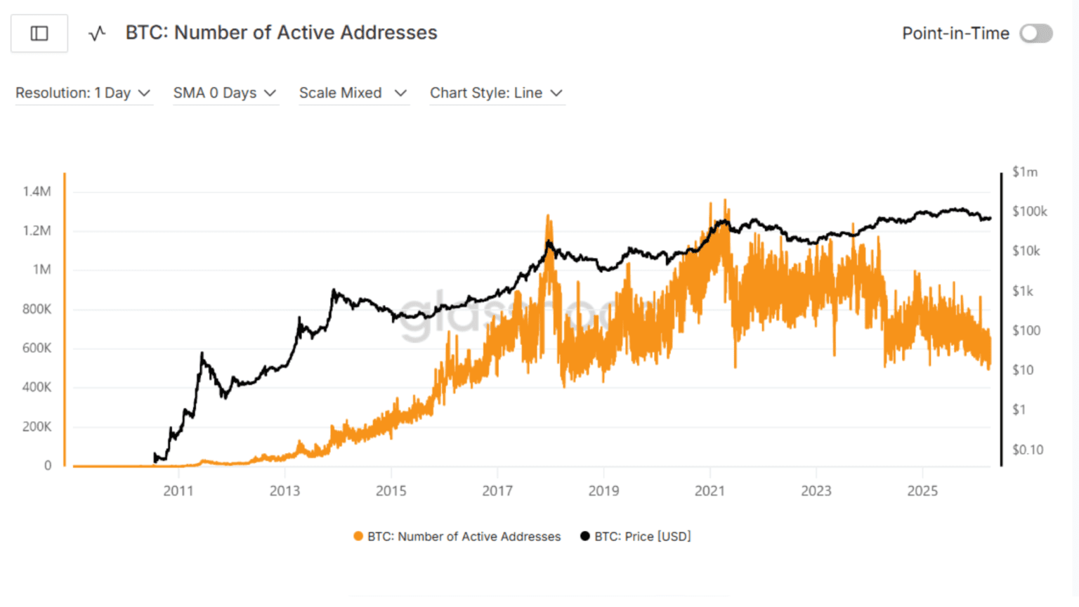
Active addresses track the number of unique wallet addresses that send or receive at least one transaction over a set period. Most analysts use daily data, then smooth it with 7-day or 30-day averages.
This is not a count of unique users. One person can control multiple wallets. Exchanges and automated systems can also generate activity. Even with these limits, it remains the closest proxy for real network usage.
The metric focuses on participation, not just holding. It answers a simple question. How many entities are actually using the network right now?
The signal depends on price context. Always read both together. Rising active addresses with rising price signals healthy demand. More participants are entering the network. The trend has support from real usage.
Rising price with falling active addresses is a warning sign. Price is moving up, but fewer participants are involved. This often points to whale-driven moves or leverage, not broad demand.
Falling price with rising active addresses suggests accumulation. Activity increases while price drops. This often reflects long-term buyers stepping in.
Falling price with falling active addresses signals weak conditions. Participation drops alongside price. This reflects low demand or market apathy.
Short-term spikes can happen. Focus on sustained trends over weeks, not single-day moves.
Bitcoin Daily Active Addresses (as of Q2 2026): 623,382
6-month trend: Declining
Signal: Activity is below the 6-month average. Participation has cooled. This suggests reduced retail activity and a shift toward holding behavior.
Source: Glassnode
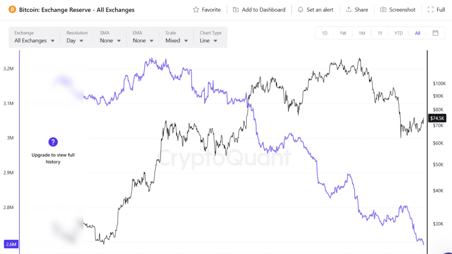
Exchange flows track how Bitcoin moves between personal wallets and exchange addresses. This data shows whether coins are being positioned for selling or long-term holding.
Exchange inflows measure BTC sent from external wallets to exchange-controlled addresses. This action usually happens before selling, trading, or using leverage. Coins sitting on exchanges are easier to sell at any moment. Because of this, rising inflows increase potential sell pressure in the market.
Exchange outflows measure BTC withdrawn from exchanges to personal wallets or cold storage. This behavior signals a shift toward holding. Investors move coins off exchanges when they do not plan to sell in the short term. It also reflects a preference for self-custody and security over convenience.
Net flow is the difference between inflows and outflows. Positive net flow means more BTC is entering exchanges than leaving. This increases exchange reserves and adds sell-side supply. Negative net flow means more BTC is leaving exchanges. This reduces available supply and supports price over time.
This metric mainly focuses on spot exchanges. Data providers track and label thousands of exchange addresses. This makes the data reliable for Bitcoin and Ethereum. For smaller assets, the signal can be less accurate due to incomplete labeling.
Exchange flow data becomes useful when combined with trends, not single events.
Large inflow spikes often appear before sell-offs. When a high volume of BTC moves to exchanges in a short time, it can signal that holders are preparing to sell. These spikes are not always bearish, but repeated inflows over several days often align with local tops.
Sustained outflows are a stronger signal. When BTC consistently leaves exchanges, available supply drops. This reduces immediate selling pressure. Over time, this creates a supply squeeze if demand remains stable or increases.
Context matters at every step. A single large transfer may be internal movement or exchange rebalancing. It does not always reflect market intent. Broader trends across multiple weeks carry more weight and provide clearer signals.
Rising price with strong outflows reflects healthy market structure. Demand is increasing while supply is shrinking. Rising price with heavy inflows can signal distribution, where large holders sell into strength.
Falling price with outflows often signals accumulation. Investors withdraw coins during weakness, suggesting long-term positioning rather than panic selling.
Bitcoin Exchange Reserves (as of Q2 2026): 2,693,000 BTC
6-month change: –170,000 BTC
Net flow trend: Outflows dominating
Signal: Exchange balances continue to decline and sit near multi-year lows. Coins are steadily moving into self-custody. This points to ongoing accumulation and reduced sell-side pressure in the current market structure.
Source: CryptoQuant
KEY CONCEPT: “Not your keys, not your coins” has a clear on-chain signal. When investors move BTC off exchanges into personal wallets, they show long-term intent. Sustained outflows reduce the supply available for selling and support stronger market structure over time.
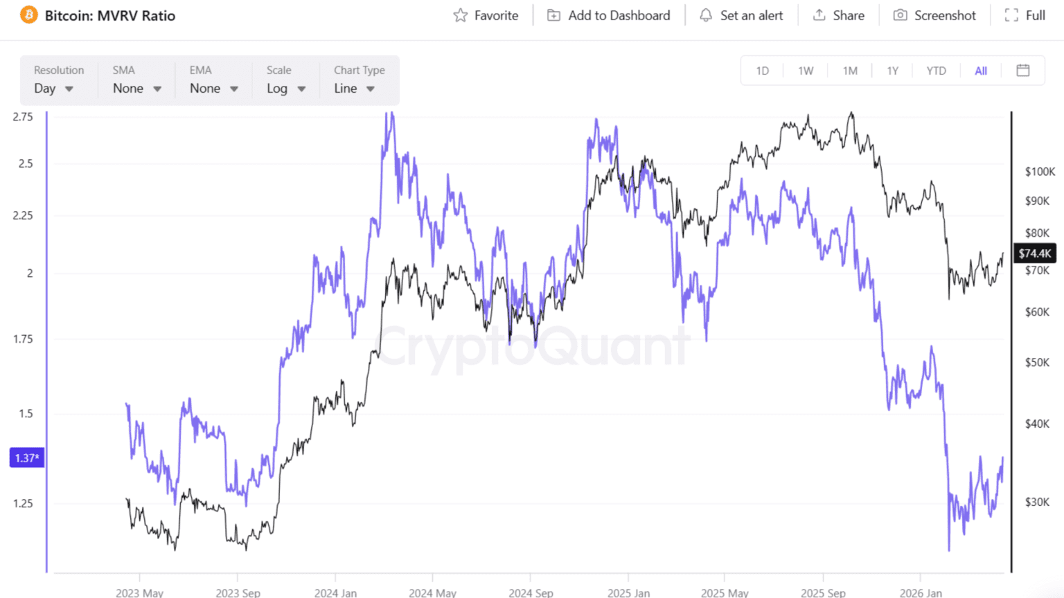
For those searching for the MVRV ratio explained in simple terms, here is how it works. The MVRV (Market Value to Realized Value) ratio compares Bitcoin’s current market capitalization to its realized capitalization. Realized capitalization values each coin at the price it last moved on-chain, not the current market price. This reflects what investors actually paid for their holdings.
An MVRV above 1 means the average holder is in profit. An MVRV below 1 means the average holder is at a loss. This makes MVRV a simple way to measure overall market positioning.
Realized value is key to understanding this metric. Instead of assuming all coins were bought at today’s price, it tracks the cost basis of the network. Coins that have not moved for years still carry their old price. This creates a more accurate view of investor behavior.
MVRV acts as a market-wide profit and loss indicator. It shows whether participants are sitting on gains or losses. This directly affects selling pressure. When profits are high, the incentive to sell increases. When losses dominate, selling pressure fades.
MVRV works best when viewed in ranges. Each range reflects a different phase of the market cycle. MVRV above 3.5 signals overheated conditions. The average holder has large unrealized profits. Selling pressure tends to increase. Previous cycle tops have formed in this zone.
MVRV between 2.5 and 3.5 signals an elevated market. Profit-taking begins to rise. The trend can continue, but risk increases. MVRV between 1.0 and 2.5 is the healthy range. Most holders are in profit, but not excessively. This is where sustainable trends develop.
MVRV below 1.0 signals undervaluation. The average holder is at a loss. Selling pressure is reduced. This zone has historically marked accumulation phases.
Think of MVRV as a sentiment gauge. When most participants are in profit, selling becomes attractive. When most are at a loss, selling slows down.
Bitcoin MVRV Ratio (as of Q2 2026): 1.37
Zone: Healthy
Signal: The market sits in a mid-cycle range. Holders are in moderate profit, but not at extreme levels. This suggests room for further expansion without heavy selling pressure.
Source: Glassnode/Cryptoquant
NUPL and SOPR both focus on profit and loss across the Bitcoin network, but they measure different layers of behavior.
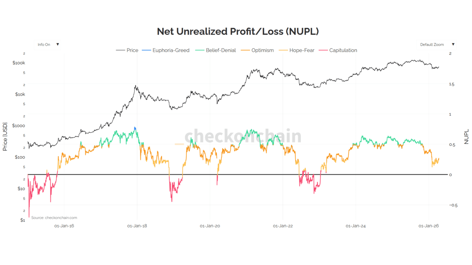
NUPL, or Net Unrealized Profit and Loss, tracks the difference between all unrealized profits and unrealized losses across every coin in circulation. It shows whether the market as a whole is sitting in profit or loss. A high value means most holders are in profit. A low or negative value means most holders are underwater. This makes NUPL a broad measure of market positioning and sentiment.
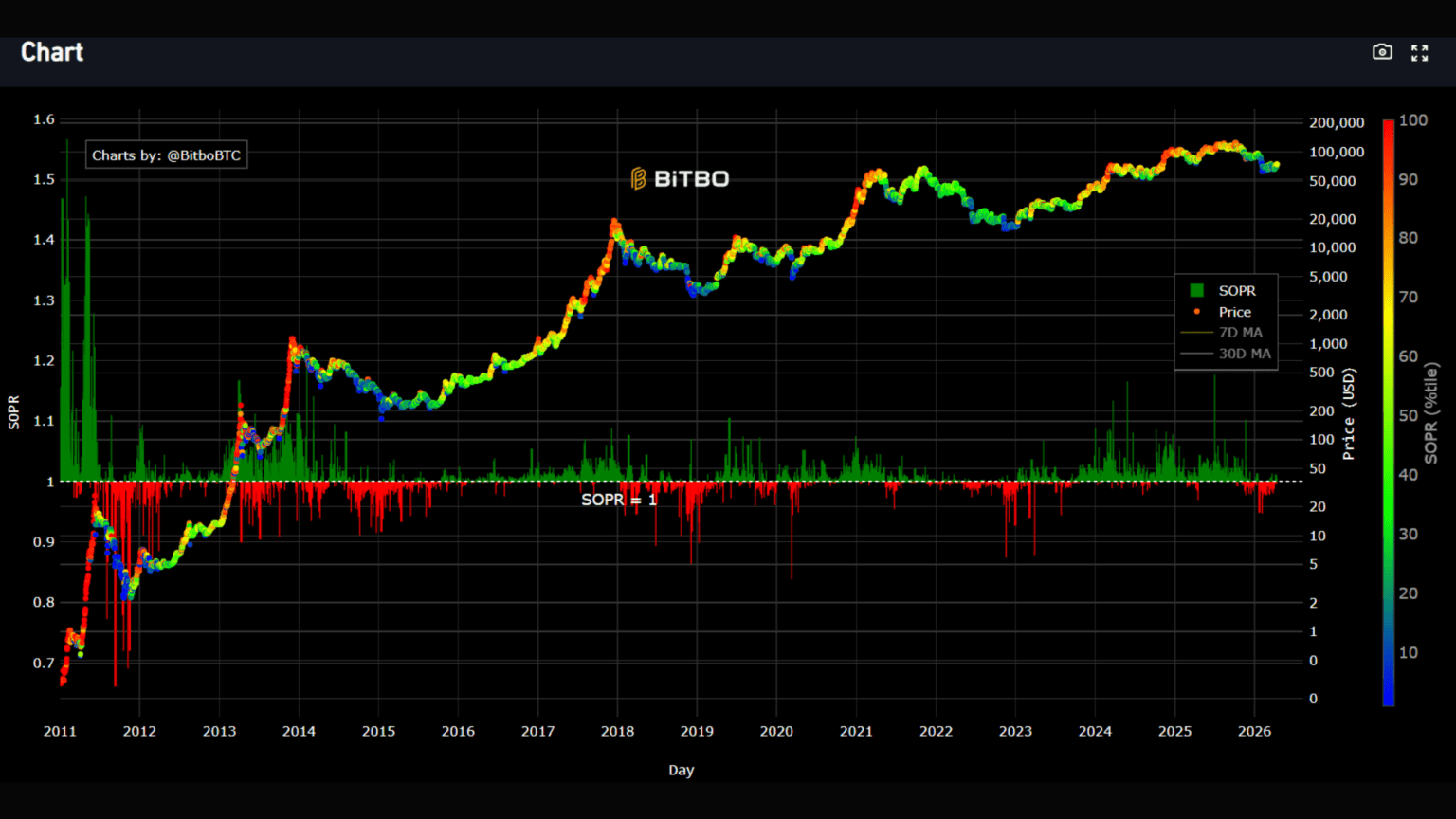
SOPR, or Spent Output Profit Ratio, focuses on coins that are actually moving. It measures whether those coins are being spent at a profit or a loss. If SOPR is above 1.0, coins are being sold in profit. If it is below 1.0, coins are being sold at a loss. This gives insight into real-time behavior rather than just positioning.
Together, these metrics complement each other. NUPL shows how the market feels. SOPR shows how the market acts. One reflects unrealized conditions, the other reflects realized decisions.
NUPL works as a sentiment scale. Each range reflects a different phase of the market cycle.
Above 0.75 signals euphoria. Most holders are deep in profit. Selling pressure tends to increase.
Between 0.5 and 0.75 reflects belief. This is a strong and sustained uptrend.
Between 0.25 and 0.5 shows early optimism. The market is recovering from prior weakness.
Between 0 and 0.25 reflects anxiety. Participants are uncertain and cautious.
Below 0 signals capitulation. Most holders are at a loss. This has historically marked cycle bottoms.
SOPR provides a cleaner trend signal through the 1.0 level.
In strong uptrends, SOPR stays above 1.0 and often rebounds at that level. This shows that holders are not willing to sell at a loss. Demand is strong enough to absorb selling.
In weaker conditions, SOPR struggles to stay above 1.0. It often gets rejected at that level. This shows that holders exit positions once they reach breakeven, adding selling pressure.
When both metrics align, the signal strengthens. High NUPL with SOPR above 1.0 suggests profit-taking conditions. Low NUPL with SOPR below 1.0 reflects stress and forced selling.
Bitcoin NUPL (as of Q2 2026): 0.26, Zone: Optimism / Hope
Bitcoin SOPR (7-day MA, as of Q2 2026): 1.00, Above 1.0
Combined signal: The market has moved out of anxiety into early optimism. Holders are realizing modest profits on spent coins while the overall unrealized position remains positive but not extreme. This setup has historically appeared during recovery phases where selling pressure eases and demand can build without immediate distribution.
Track both at Glassnode: NUPL and SOPR.
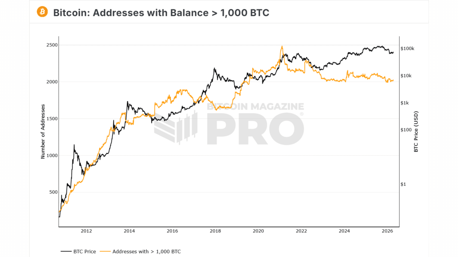
Whale activity tracks the behavior of the largest holders on a blockchain. For Bitcoin, whales are typically defined as wallets holding 1,000 BTC or more. For Ethereum, the common threshold is 10,000 ETH. These large holders control significant capital and can influence market liquidity when they act.
This metric focuses on three things. The number of whale wallets. The total balance held by these wallets. And large transfers between wallets and exchanges.
The threshold matters because smaller holders do not move markets in the same way. A wallet holding 1,000 BTC represents tens of millions in capital. When multiple wallets of this size accumulate or distribute, the effect can show up in price over time.
Whales are not always individuals. Many large wallets belong to institutions, funds, exchanges, or custodians. On-chain data tracks addresses, not identities. Even with this limitation, changes in whale behavior provide a useful view into how large capital is positioning.
Whale activity is most useful when viewed as a trend, not a single event.
Rising whale wallet counts or increasing balances signal accumulation. Large holders are adding to positions. This pattern has often appeared before or during market uptrends.
Declining balances or consistent inflows to exchanges suggest distribution. Whales may be reducing exposure or preparing to sell into strength.
Large transfers to exchanges attract attention. A single movement of thousands of BTC can trigger alerts. These events can precede short-term volatility, but they are not always bearish. Some transfers are internal movements, OTC deals, or custody changes.
Context is critical. One transaction does not define the trend. Multi-week patterns across many wallets carry more weight. Combining whale data with exchange flows and price action improves reliability.
BTC wallets holding 1,000+ BTC (as of Q2 2026): 2,028
6-month change: +142
Trend: Accumulation
Signal: The number of large holders continues to rise. This suggests steady accumulation by high-capital participants. The trend aligns with reduced exchange balances and points to long-term positioning rather than distribution.
Source: Bitcoinmagazinepro
RED FLAG: Do not blindly follow whales. Whale activity provides context, not certainty. Large holders operate with different strategies and time horizons. A whale buying does not guarantee short-term price movement. A whale selling does not require a reaction. Use this metric alongside others, not in isolation.
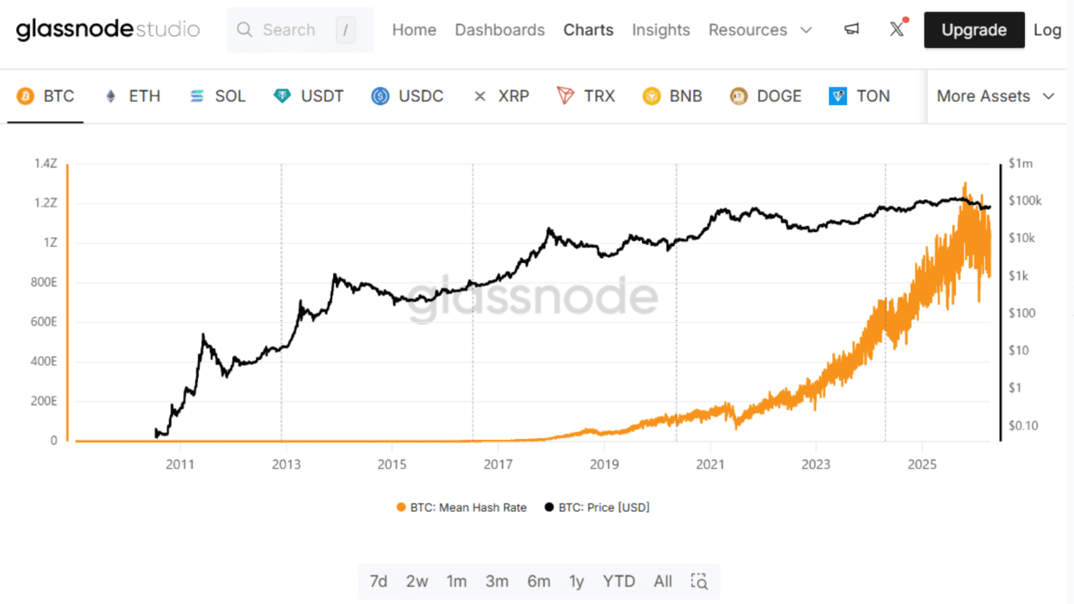
Hash rate measures the total computational power used to secure the Bitcoin network. It represents how much work miners are performing to validate transactions and add new blocks.
It is expressed in exahashes per second. One exahash equals one quintillion hashes per second. This reflects the scale of competition between miners solving cryptographic puzzles.
Hash rate is directly linked to network security. A higher value makes it more difficult and expensive to attack the network. It increases the cost of rewriting transaction history or disrupting operations.
It also reflects miner commitment. When mining is profitable, more machines come online and hash rate rises. When profitability drops, weaker miners shut down and hash rate declines.
Bitcoin adjusts to these changes automatically. Mining difficulty updates every 2,016 blocks, or roughly every two weeks. This keeps block production stable at around 10 minutes, even when hash rate changes.
This makes hash rate both a security metric and an economic signal. It shows how much capital and infrastructure are actively supporting the network.
Hash rate becomes more useful when combined with price trends.
Rising hash rate with rising price signals strong conditions. Miners are expanding operations and network security is increasing. This reflects confidence in long-term profitability.
Rising hash rate during falling price is a stronger signal. Miners continue operating despite lower revenue. This often appears near market bottoms, where long-term participants remain active.
Falling hash rate usually appears in weaker market phases. Less efficient miners exit due to rising costs or lower rewards. This can reduce security in the short term, but difficulty adjustments restore balance.
Hash rate moves slowly. New mining hardware takes time to deploy. Because of this, long-term trends are more reliable than short-term changes.
Short-term drops can occur due to power costs, regulations, or regional outages. These should be viewed with moving averages rather than daily data.
Bitcoin Hash Rate (as of Q2 2026): 1,004 EH/s (30-day average)
6-month change: –62 EH/s
Trend: Modest contraction
Source: Glassnode / CoinWarz
Signal: Hash rate has declined slightly but remains near all-time highs. This shows strong miner commitment despite softer market conditions. The network remains secure, and large-scale operators continue to support it. This type of stability has historically appeared during consolidation phases before broader recovery.
You do not need paid subscriptions to start using on-chain data. This section also shows how to read on-chain data using free platforms. Most of the core metrics in this guide are available through free dashboards. The tools below cover everything from simple charts to advanced custom queries.
Each tool serves a different purpose. LookIntoBitcoin is the easiest starting point. It requires no account and focuses on long-term indicators. Glassnode provides more structured data but limits free access. CryptoQuant is strong for exchange flows and live alerts. Dune is more advanced and useful once you understand the basics.
Getting started is simple. Follow a clear process.
Step 1: Start with LookIntoBitcoin. Focus on MVRV and cycle indicators. No setup required.
Step 2: Set up Whale Alert on Twitter or Telegram. This gives real-time updates on large transactions.
Step 3: Create a free Glassnode account. Use it for weekly snapshots of key metrics.
Step 4: Use CryptoQuant to track exchange inflows and outflows. This helps you spot shifts in supply.
Step 5: Bookmark this guide. It is updated quarterly with fresh data and signals.
If you want to go deeper, explore Dune Analytics. It allows you to build custom dashboards and combine multiple metrics in one place.
The table below brings together all seven metrics into a single quick-reference snapshot. Use it as your weekly dashboard.
These metrics point to a market in a recovery phase. Participation remains moderate, but supply is tightening. Exchange balances are falling while large holders continue to accumulate. Valuation metrics sit in a healthy range, not at extremes. This combination suggests improving structure, even if momentum is not fully visible in price yet.
On-chain analysis is not a prediction tool. It is a way to read real behavior. Most retail investors ignore this data. Checking these metrics weekly helps you understand where capital is actually moving.
For deeper analysis, explore the blockchain evaluation metrics article. To build custom dashboards, use the Dune Analytics guide.
This article is updated quarterly. Last updated: April 14, 2026. Bookmark it and check back. Follow OurCryptoTalk X for more on-chain updates.
All the opinions in this article are that of the author and in no way are financial advice. Our Crypto Talk and the author always suggest you do your own research in crypto and to never take anything as financial advice that you read on the internet. Check our Terms and conditions for more info.