How To Know if a chart is a good buy using simple market structure rules like trends, higher highs, and break of structure signals.
Most people overcomplicate trading. If you want to understand how to know whether a chart is a good buy, as someone who has spent 10,000+ hours on charts in the past 10 years, let me save you a lot of time and money: you can get very far with absolute basics that people seem to forget.
By the end of this article, you’ll know how to tell if a chart is a good buy in under 3 seconds. This works for stocks, commodities, and crypto. Not so much for forex, but if you’re trading forex, you might want to rethink that anyway.
Most people just hit buy without even looking at the chart. They hear about a stock on the news. Someone on X says a coin is going to moon. A friend tells them to buy something. So they buy it.
Then they hold it for 6 months while it ranges and does absolutely nothing. or worse it bleeds out and they sit there watching their money disappear wondering what went wrong.
This is why index funds are so popular. Not because they’re the best investment, but because most people have no idea what to look for when they open a chart. So they give up and just buy SPY.
I’m not saying technical analysis is always 100% correct, because it isn’t. Trading is about probabilities, and as a trader, you want to do everything you can to put the odds in your favor.
Ok but what the fu*k does putting the odds to our favor mean? Let me explain like you are 5 years old with 47 chromosomes instead of 46.
you don’t need any indicators for this. it all comes down to market structure.
First thing you do after opening a chart: zoom out. Go to the weekly timeframe or higher if possible. You want to see what’s actually happening, not the noise on the 1-hour chart. Second, look at the market structure
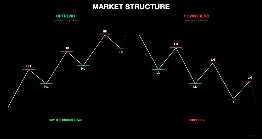
a chart that is in a uptrend will print higher highs and higher lows. a chart that is in a downtrend will print lower lows and lower highs.
now here’s the important part. what does it mean when market structure “breaks”?
Imagine a chart going up nicely, higher high, higher low, higher high, higher low, everything looks strong. Then one day, price drops and goes below the most recent higher low. That higher low was the break line, the level where buyers were supposed to step in again, but they didn’t. Sellers pushed through it. This is how to know when a chart is no longer a good buy, because the structure just broke and the trend is likely shifting.
The same thing works in reverse. A chart in a downtrend prints lower highs and lower lows. Then one day, price pushes above the most recent lower high. Sellers were supposed to reject it there, but they didn’t. Buyers stepped in and pushed through.
that’s also a break in market structure but this time it’s bullish. the pattern of lower highs just ended. could be the start of a reversal.
this is literally the most important thing you can learn from this article. when the pattern of highs and lows breaks, something is changing.
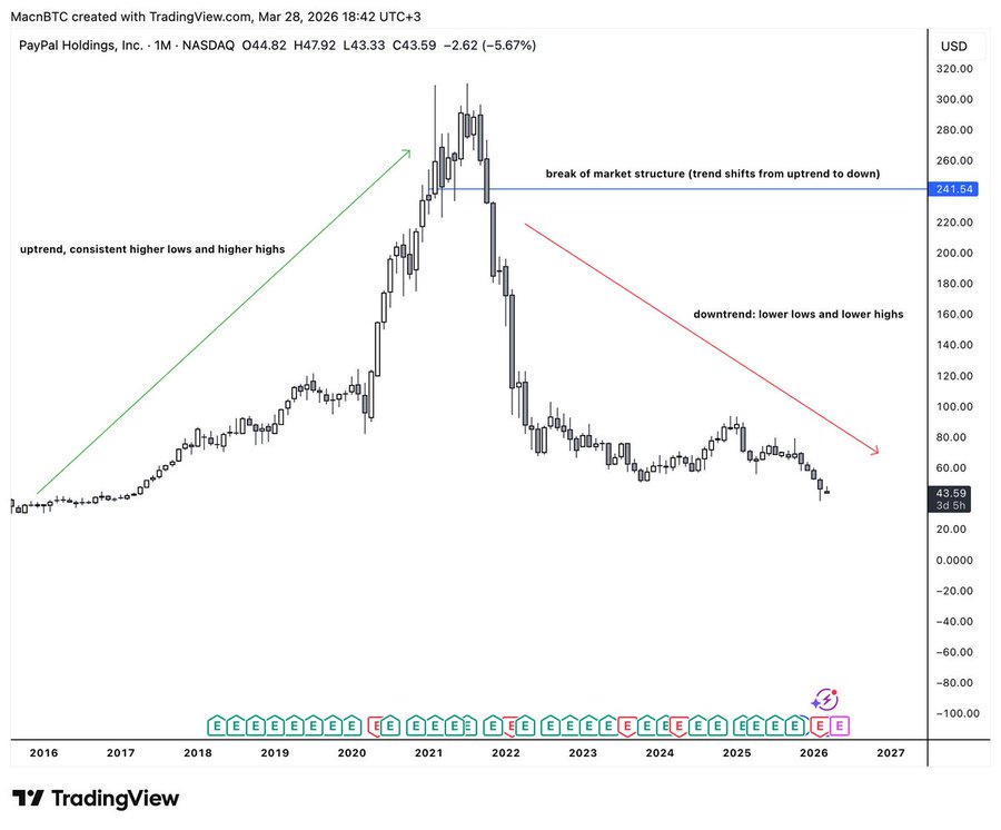
$PYPL on the monthly is a good example to demonstrate market structure. On the left we can see a clear uptrend. the chart is printing higher lows and higher highs, price is going up.
At the peak in 2021, we see a clear break in market structure. The chart stops making higher highs and higher lows, and price drops below the previous higher low from months earlier. That level was supposed to hold, but it didn’t. Buyers lost control, sellers took over, and the trend shifted. This is how to know when a chart is no longer a good buy, as it signals a clear transition into a downtrend where you should sell and stay away for a while.
Now fast forward to the present day. The chart is still printing lower lows consistently. And I know there are people out here saying $PYPL is undervalued and they believe in it. But the chart says something different. If you want to believe in something, go believe in God.
anyway moving on, more practical examples so you can understand everything and start implementing this to your trading.
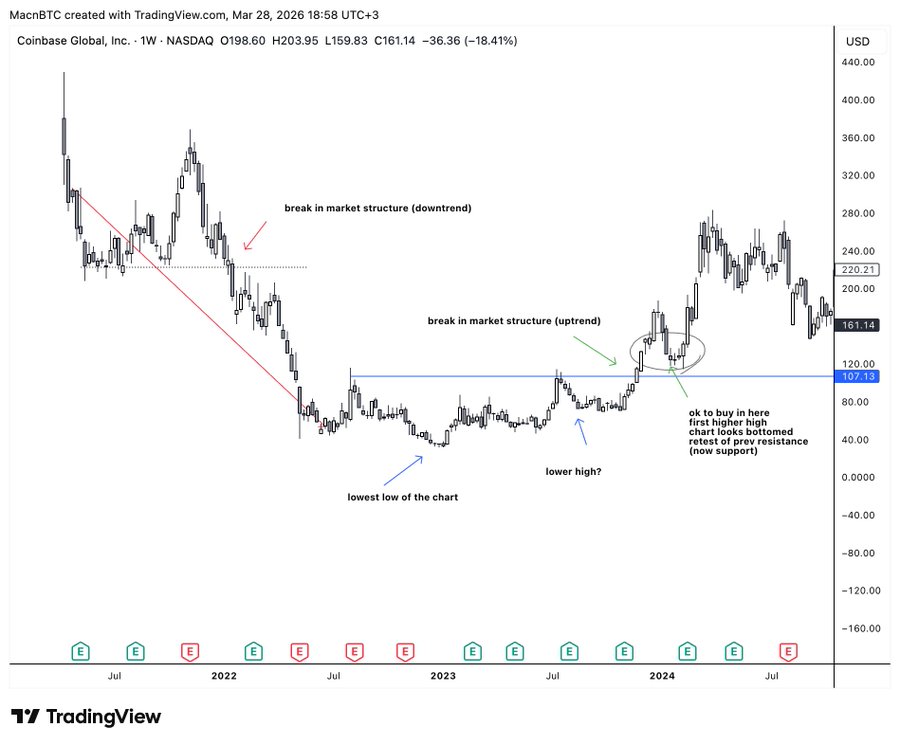
Let’s look at $COIN on the weekly chart. First, on the left, we see a clear break in market structure with a support break, leading to a lower low and the start of a downtrend. Then the chart prints the lowest low. After that, we get a potential lower high, followed by a base forming. Eventually, price breaks above that lower high. That marks a break in market structure to the upside, forming the first higher high and confirming a new uptrend.
PAY ATTENTION to where I put “ok to buy”, realize you don’t have to be early. It’s ok to be “late”. In fact I recommend you to be a little bit late. This is how to know when a chart is actually a good buy. It’s far better to be late and buy after a confirmed uptrend than to be early hoping a downtrend will finish. Trust me when I say this, I lost a lot of money before I understood this, so don’t make the same mistake.
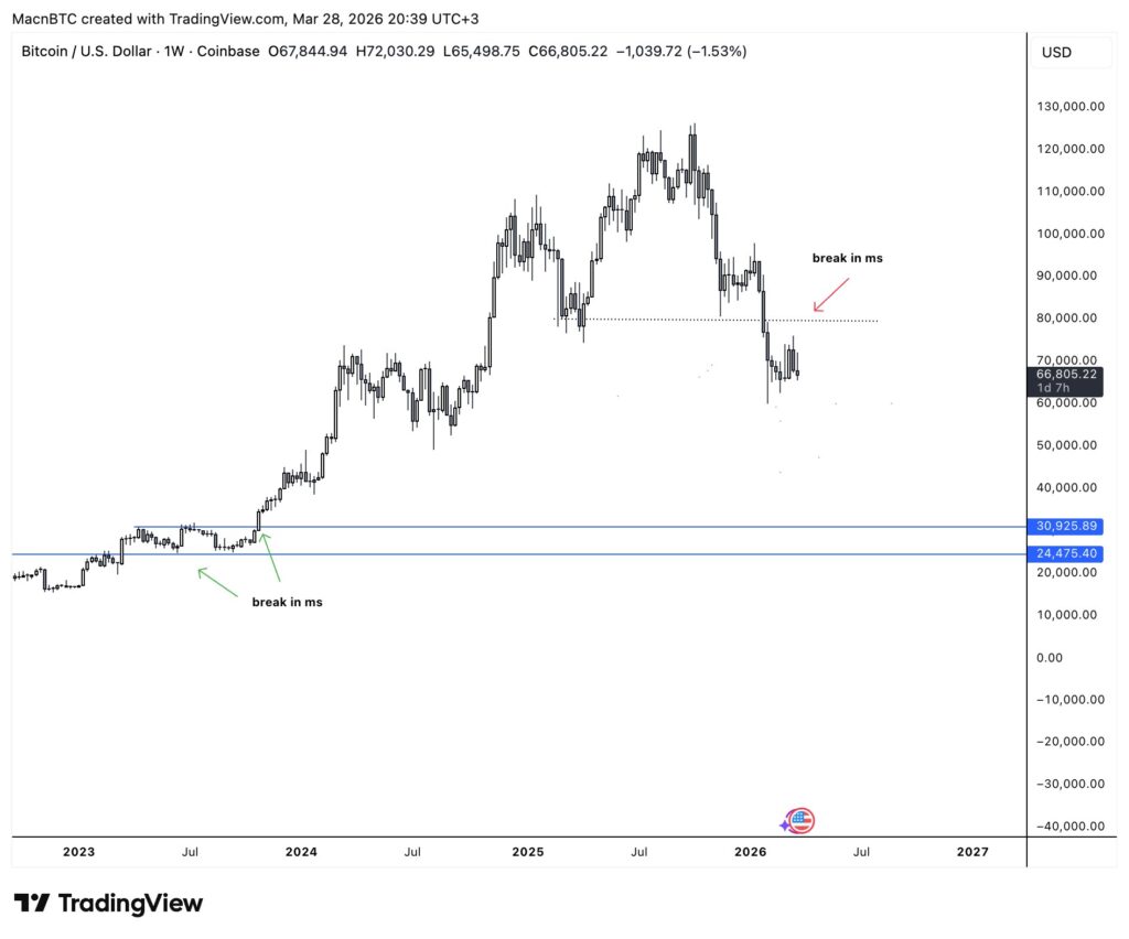
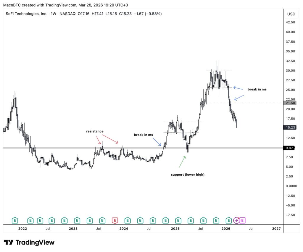
Let’s take a look at present day $BTC, another example where you can see both a bullish break in ms and a bearish break in ms.
In 2023, $BTC was sitting around $15–20k, printing lower highs and lower lows, with everyone saying crypto is dead. Then price broke above the previous lower high around $25k (green “break in ms” on the chart). That break changed everything. From there, it kept printing higher highs and higher lows all the way to $125k+. This is how to know when a chart shifts from bearish to bullish. Notice how long you could have been “late” and still made money. You didn’t need to buy the $15k bottom, you just needed to see the structure flip around $25–30k and buy that. Even weeks or months later, you still would have made money.
now look at the right side. $BTC topped around $125k. lower highs started forming. then price broke below a higher low around $85-90k (red “break in ms” on the chart). structure just broke to the downside. sitting at $66k right now.
I’m not saying $BTC is going to zero. But when you look at the chart, it’s clear the trend has turned bearish. Best case, we get a retest of that market structure break level. Until then, expect more sideways chop and weak price action, even more than what we’ve already seen.
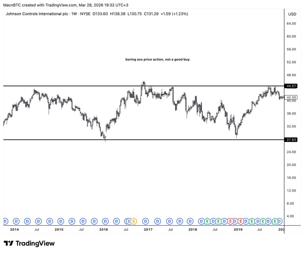
let me show you a chart that did NOTHING, for 5+ years. same boring sideways range, no break in market structure, just sideways boring chop. YOU DO NOT WANT TO BUY CHARTS THAT LOOK LIKE THIS, IT’S BETTER TO TAKE YOUR MONEY GO TO VEGAS AND PUT IT ALL ON BLACK,
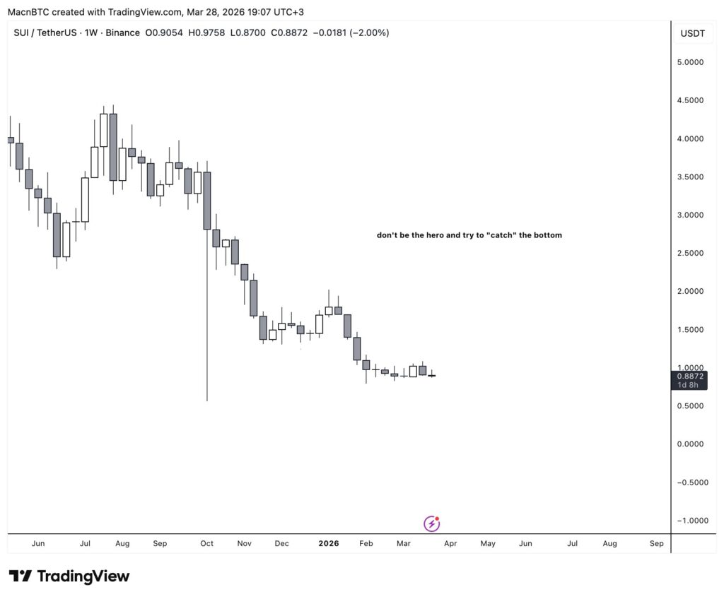
lesson nr 1: don’t try to be the hero and “catch the bottom”, this will cost you a lot of money and energy. if there is a confirmed downtrend without any strength its better to sell, cut losses and find something else. I have been that guy. I sat in positions watching them bleed for months because I was convinced “this is the bottom.” it wasn’t the bottom. the chart was making lower lows the entire time and I just refused to see it. don’t be me in 2018. if the structure says down, it’s down. move on.
lesson nr 2: the market will try to trick you, again and again and again. if the market structure just turned bullish and you are afraid you fucked up and bought the top I can only recommend one thing: zoom out. zooming out to a higher timeframe helps you manage your emotions better and prevent you from doing stupid buys and sells based on emotions. I can’t tell you how many times I’ve panicked on a 4 hour chart and then zoomed out to the weekly and realized nothing actually changed. the structure was still intact. I was just looking too close. here is also where fundamental analysis comes in handy. if fundamentals or narrative can back your technical analysis then you likely have a good trade going.
lesson nr 3: it’s okay to be late, but not crazy late. and here is where you will likely ask me: how do I know if I’m crazy late. well the answer is it’s hard to say. and this takes years on the charts to identify and even after years you will still fuck up and be wrong. technical analysis will only take you so far, if you pair it with news/narrative analysis and also fundamental analysis you will go far. a good rule of thumb is if the chart has already made 3-4 higher highs and higher lows on a high time frame such as 2w or monthly and price is extended way above where the structure shifted, you’re probably late. not always but probably. better to wait for a pullback that makes a higher low and enter there then to chase a move that already happened.