Key Bitcoin Metrics You Should Know (Beyond Price)
Discover 8 key Bitcoin metrics beyond price, including hashrate, MVRV, and Puell Multiple, to make smarter investment decisions
Author: Chirag Sharma
Bitcoin’s price often dominates discussions, but serious investors know that market movements depend on more than just price trends. Key Bitcoin metrics provide deeper insights into network health, market sentiment, and long-term trends, helping traders and investors make informed decisions. Understanding these metrics can improve investment strategies, reduce risks, and identify opportunities before they become mainstream knowledge.
Metrics such as Bitcoin’s hashrate, active addresses, realized cap, and exchange reserves offer crucial data points. They help assess whether Bitcoin is in accumulation or distribution phases, whether institutional interest is growing, or whether market sentiment is overheating. By tracking these key indicators, investors can gain a strategic edge, positioning themselves ahead of major market movements. This article explores essential Bitcoin metrics beyond price, explaining their significance and how they can guide better investment decisions.
Bitcoin Hashrate
The hashrate represents the total computational power securing the Bitcoin network. A higher hashrate means more miners are competing to solve cryptographic puzzles, making the network more secure against attacks.
Why Hashrate Matters
- Security Indicator: A strong hashrate prevents 51% attacks, where malicious actors could manipulate transactions.
- Mining Activity: An increasing hashrate suggests strong mining interest and network confidence.
- Market Correlation: Historically, Bitcoin’s price has correlated with hashrate trends, often lagging behind mining power shifts.
- Energy Commitment: Hashrate reflects the energy commitment to the network, an essential factor in evaluating Bitcoin’s sustainability.
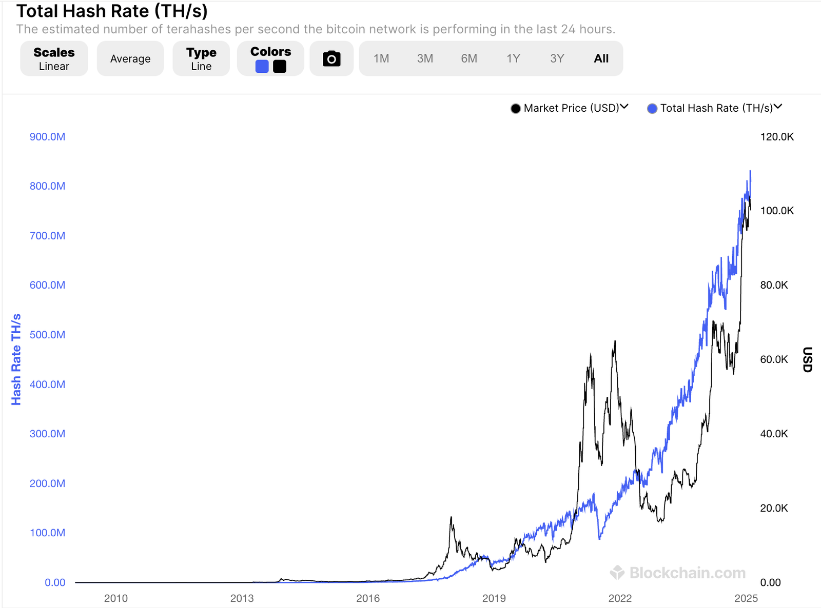
Investment Implications
Understanding hashrate trends can help investors predict market conditions. A rising hashrate suggests long-term optimism among miners, while a sudden decline might indicate miner capitulation, often leading to temporary price corrections. Additionally, tracking hashrate alongside difficulty adjustments can offer insights into potential price bottoms or tops. Since miners must sell Bitcoin to cover operational costs, changes in hashrate can also indicate potential selling pressure.
Active Bitcoin Addresses: Network Adoption
The number of active Bitcoin addresses is a key metric for assessing network activity and adoption. It represents the number of unique addresses participating in transactions within a given period. This metric is often used to gauge Bitcoin’s fundamental growth and real-world usage beyond speculation.
Why Active Addresses Matter
- Network Growth: An increase in active addresses suggests higher Bitcoin adoption and user engagement.
- Liquidity Indicator: More active addresses indicate a more liquid market with robust trading activity.
- Market Sentiment: A decline in active addresses could signal reduced interest, often preceding bearish trends.
- Real-World Utility: More transactions occurring through unique addresses suggest broader Bitcoin integration in daily financial activity.
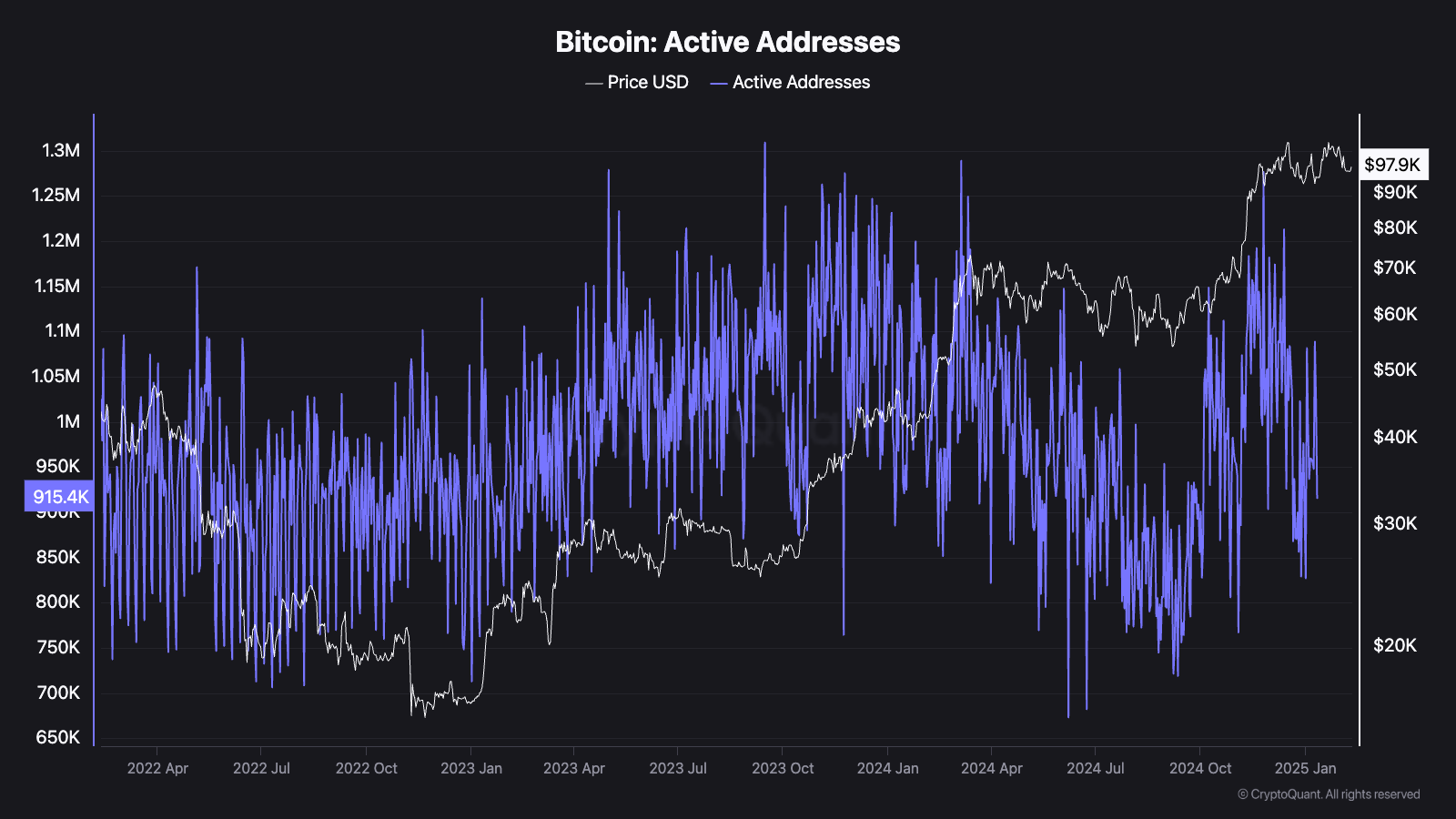
How Investors Use This Metric
Active address growth often signals the start of bullish trends. A surge in new wallet activity suggests new participants entering the market, which can drive demand and price increases. Conversely, declining active addresses may indicate reduced interest, leading to bearish conditions. Tracking this metric alongside other indicators such as transaction volume and wallet age can enhance market predictions and inform smarter investment strategies. Additionally, a spike in active addresses during price downturns might indicate strong buying interest, often leading to price recoveries.
By analyzing the relationship between active addresses and other network health indicators, investors can gain a clearer picture of Bitcoin’s adoption curve and future price potential.
Bitcoin Supply on Exchanges: A Leading Indicator for Price
One of the most crucial metrics for Bitcoin investors is the amount of BTC held on centralized exchanges. This indicator helps determine whether investors are in an accumulation phase (bullish) or preparing to sell (bearish).
What is Bitcoin Supply on Exchanges?
Bitcoin held on exchanges represents the amount of BTC readily available for trading or withdrawal. When investors move BTC to exchanges, they often intend to sell. Conversely, when BTC outflows from exchanges increase, it signals accumulation and reduced selling pressure.
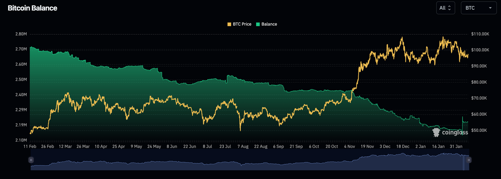
Why This Metric Matters
- Low Exchange Supply = Bullish Signal
When Bitcoin reserves on exchanges decrease, it suggests that investors are withdrawing BTC for long-term storage, reducing immediate selling pressure. This behavior often precedes major price rallies. - High Exchange Supply = Bearish Signal
An increase in Bitcoin reserves on exchanges means that holders are more likely to sell, increasing potential downward price pressure. This typically happens during periods of uncertainty or market peaks.
Historical Data: The 2020 Bull Run Example
In mid-2020, Bitcoin exchange reserves began dropping significantly. Long-term holders (whales and institutions) were accumulating BTC off-exchange, reducing available supply. By the end of 2020, Bitcoin surged from $10,000 to over $30,000.
A similar trend occurred in late 2023 when exchange balances hit multi-year lows, leading to another price rally. Tracking this metric helps investors anticipate supply shocks and market trends.
How to Track It
- Use platforms like Glassnode, CryptoQuant, and Santiment to monitor exchange reserves.
- Compare BTC exchange supply with price action to spot divergences.
- Watch for sharp declines in exchange reserves—these often indicate an upcoming bull phase.
By keeping an eye on this metric, investors can anticipate shifts in Bitcoin’s market cycle and position themselves accordingly.
Bitcoin MVRV Ratio: Spotting Overvalued & Undervalued
The Market Value to Realized Value (MVRV) Ratio is a critical Bitcoin metric that helps identify whether BTC is overvalued or undervalued relative to historical data.
What is the MVRV Ratio?
MVRV compares Bitcoin’s market capitalization (total value based on current price) to its realized capitalization (total value based on when coins last moved).
- MVRV > 3.5 -> Market Overheated (Greed Phase)
When the ratio exceeds 3.5, Bitcoin is likely overbought, and the market is in an extreme greed phase. This often precedes sharp corrections. - MVRV < 1 -> Market Undervalued (Fear Phase)
When MVRV drops below 1, it suggests that Bitcoin’s market value is lower than its realized value, signaling a bottoming phase. Historically, these moments have been prime buying opportunities.
How MVRV Predicts Bull & Bear Cycles
- Bull Market Peaks: Bitcoin’s MVRV ratio surged past 4.0 in late 2017 and early 2021 before sharp corrections followed.
- Bear Market Bottoms: In late 2018, early 2020, and late 2022, the MVRV ratio dipped below 1.0, signaling market bottoms before significant uptrends.
How Investors Use the MVRV Ratio
- Monitor Glassnode or LookIntoBitcoin for MVRV data.
- Avoid buying when MVRV is extremely high (above 3.5).
- Look for accumulation when MVRV is under 1.0, signaling a discount.
- Combine with other metrics like Bitcoin Dormancy Flow for better confirmation.
By understanding MVRV trends, investors can better time entries and exits, avoiding overbought conditions while capitalizing on undervaluation periods.
Bitcoin Realized Cap vs. Market Cap: The True Value of BTC
Market capitalization (market cap) is a widely used metric, but it doesn’t always reflect Bitcoin’s actual economic value. That’s where Realized Cap comes in—it provides a more accurate representation of Bitcoin’s true market health.
What is Realized Cap?
Realized Cap values Bitcoin based on the price at which each coin last moved, rather than the current market price. This removes speculative price swings and highlights actual investor activity.
Example: If 1 BTC was last moved at $10,000, its contribution to Realized Cap is $10,000, regardless of Bitcoin’s current market price.
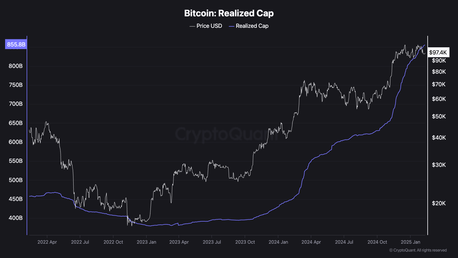
Why Realized Cap Matters More Than Market Cap
- Market Cap = Total BTC supply × Current price (Can be inflated by short-term speculation.)
- Realized Cap = Sum of BTC valued at last moved price (More stable and reflects actual value held by investors.)
Key Insights from Realized Cap Trends
- Rising Realized Cap = Healthy Adoption
A steady increase in Realized Cap means more BTC is moving at higher prices, signaling strong long-term investor confidence. - Falling Realized Cap = Market Panic
A decline in Realized Cap suggests that Bitcoin is being sold below previous purchase prices, often seen in bear markets.
How to Use This Metric for Investing
- When Market Cap is far above Realized Cap, Bitcoin may be overvalued (bubble risk).
- When Realized Cap catches up to Market Cap, Bitcoin is likely in an accumulation phase.
- Track Realized Cap using Glassnode to assess true market sentiment and avoid buying into speculative hype.
By comparing Market Cap and Realized Cap, investors can identify whether Bitcoin is in a healthy growth phase or an overheated speculative cycle.
Bitcoin Dormancy Flow: Tracking Long-Term Holders (LTHs)
Dormancy Flow helps measure the behavior of long-term Bitcoin holders (LTHs) and whether they are accumulating or selling their BTC.
What is Bitcoin Dormancy Flow?
Dormancy Flow tracks the average age of BTC being moved. When long-held coins start moving, it often signals shifts in market cycles.
How Dormancy Flow Works
- High Dormancy = Old BTC Moving (Distribution Phase)
When long-term holders start selling, it often means they are taking profits, potentially signaling market tops. - Low Dormancy = HODLers Accumulating (Accumulation Phase)
When dormancy is low, it suggests that old BTC remains untouched, which is bullish for long-term price appreciation.
Case Study: Dormancy Flow in Bull & Bear Markets
- Before the 2021 Peak: Dormancy Flow spiked as early investors took profits at all-time highs.
- At the 2022 Bottom: Dormancy Flow was at historic lows, showing HODLers accumulating, preceding a market rebound.
How to Use Dormancy Flow for Smarter Investing
- Look for dormancy spikes -> Consider taking profits as long-term holders cash out.
- Monitor low dormancy periods -> These are often great accumulation phases for long-term investors.
- Use alongside MVRV & Puell Multiple for a more comprehensive view of Bitcoin’s market cycles.
By tracking Dormancy Flow, investors can spot market tops and bottoms, aligning their strategies with seasoned holders and combining with other Bitcoin Metrics for a cycle
Bitcoin Puell Multiple: The Best Buy Zone Indicator?
The Puell Multiple is one of the most reliable Bitcoin metrics for identifying potential market tops and bottoms. It measures how much Bitcoin miners are earning compared to historical norms. Since miners play a crucial role in Bitcoin’s supply dynamics, their profitability can significantly impact price trends.
What is the Puell Multiple?
The Puell Multiple is calculated as:
Puell Multiple= Daily BTC Mined×BTC Price / 365-Day Moving Average of Miner Revenue

In simple terms, it compares the current revenue of miners to their one-year average.
How to Interpret Puell Multiple Readings
- Low Puell Multiple (<0.5) – Miner Stress (Buy Signal)
When the Puell Multiple is low, it means miners are earning significantly less than usual. This often forces inefficient miners to shut down, leading to reduced selling pressure. Historically, Bitcoin bottoms have formed during these periods. - High Puell Multiple (>4.0) – Overheated Market (Sell Signal)
When the Puell Multiple is high, miners are making excessive profits, usually indicating a peak in the market cycle. This often coincides with major price tops, as miners start selling large amounts of Bitcoin.
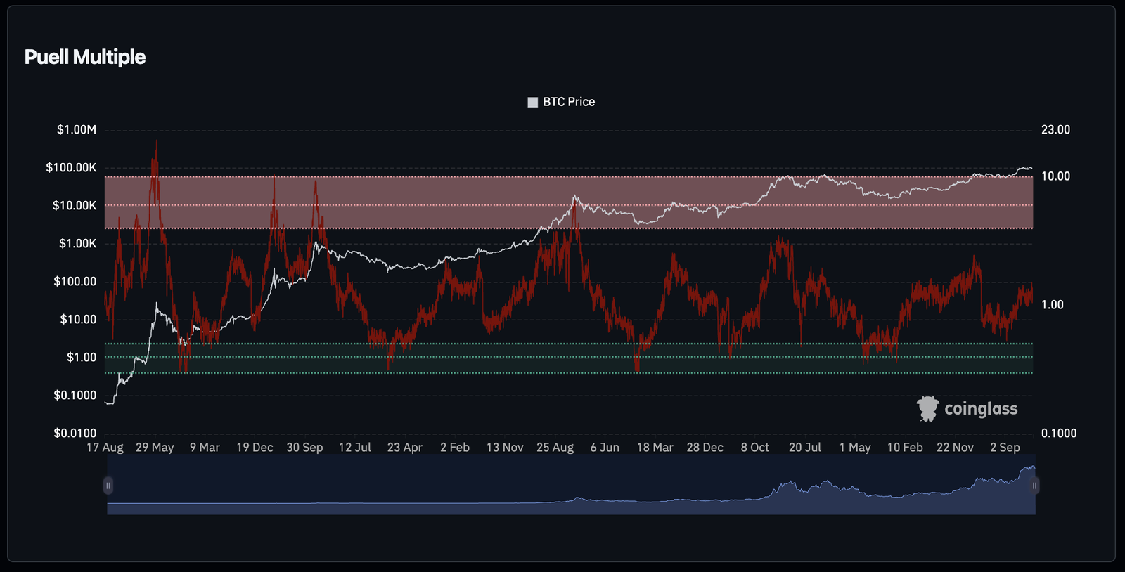
Historical Examples of the Puell Multiple’s Accuracy
- 2018 Bear Market: The Puell Multiple dropped below 0.5 before Bitcoin’s bottom at $3,200.
- 2021 Bull Run: It spiked above 4.0 right before Bitcoin’s all-time high of $69,000.
- 2022 Market Crash: The Puell Multiple signaled a bottom as miner capitulation forced a market reset.
How Investors Use This Metric
- When the Puell Multiple drops below 0.5, it is often a good time to accumulate Bitcoin.
- When it exceeds 4.0, caution is advised as the market may be overheated.
- Combining the Puell Multiple with other metrics like MVRV Ratio and Dormancy Flow improves accuracy.
The Puell Multiple provides a valuable way to gauge Bitcoin’s market cycle by analyzing miner profitability. Understanding its patterns can help investors enter and exit the market at optimal times.
Bitcoin Supply Last Active (1+ Year): Tracking Long-Term Holders
One of the strongest Bitcoin Metrics of Bitcoin’s long-term adoption is the Bitcoin Supply Last Active (1+ Year) metric. It tracks the percentage of Bitcoin that hasn’t moved for at least a year. This reflects the conviction of long-term holders (LTHs) and their willingness to hold through market cycles.
Why This Metric Matters
- Higher Percentage = Strong HODLing Behavior
When a significant portion of Bitcoin remains unmoved for over a year, it signals that long-term investors are accumulating rather than selling. Historically, a rising percentage has preceded major bull runs. - Declining Percentage = Distribution Phase
When long-term holders start moving their Bitcoin, it often means they are selling into strength. This can indicate that a bull market is reaching its peak.
Historical Data and Market Impact
- Late 2020 Bull Run: Over 60% of Bitcoin supply was inactive for 1+ year before BTC surged past $20,000.
- 2022 Bear Market: The metric hit an all-time high as long-term holders continued accumulating despite falling prices.
- Early 2024: A decline in long-term holder supply could suggest distribution before another major price rally.
How Investors Use This Metric
- When supply last active (1+ year) is rising, it means long-term investors are accumulating, which is bullish.
- When it starts decreasing sharply, it suggests that long-term holders are selling into market strength, signaling a potential top.
This metric helps investors differentiate between temporary price movements and long-term market trends.
Realized HODL (RHODL) Ratio: Measuring Market Cycle Strength
The Realized HODL (RHODL) Ratio measures the strength of market cycles by comparing the value of recent Bitcoin purchases to older ones. It helps identify when the market is overbought or oversold.
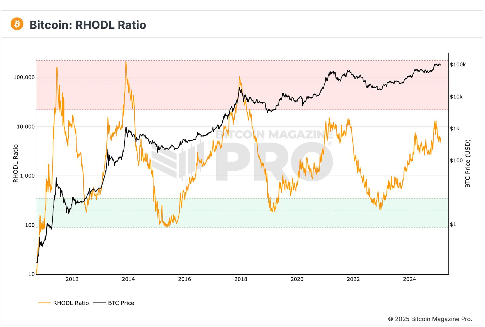
What is the RHODL Ratio?
RHODL compares the value of recently moved Bitcoin (1-week-old UTXOs) to long-held Bitcoin (1-2 year-old UTXOs).
RHODL Ratio = Value of 1-week-old BTC / Value of 1-2-year-old BTC
- High RHODL (>50,000) = Market Overheating (Potential top signal).
- Low RHODL (<300) = Market Undervaluation (Potential bottom signal).
How RHODL Identifies Market Cycles
- 2013 & 2017: RHODL peaked above 50,000 before Bitcoin’s price crashed.
- March 2020: RHODL dropped to record lows before Bitcoin’s massive recovery.
- 2021 Bull Market: The ratio surged again before the price correction.
How to Use RHODL for Investing
- When RHODL is rising above 50,000, it suggests euphoria and possible market peaks.
- When RHODL drops below 300, it indicates undervaluation and a buying opportunity.
The RHODL Ratio is a powerful metric for timing market entries and exits based on the activity of long-term holders versus short-term speculators.
Conclusion: Using Bitcoin Metrics for Smarter Investing
Bitcoin’s price is just one part of the bigger picture. The key to making informed investment decisions lies in understanding deeper market metrics. The seven Bitcoin metrics covered in this article provide critical insights into market health, investor behavior, and network security.
- Hashrate indicates network strength and miner confidence.
- Exchange Supply signals whether investors are accumulating or selling.
- MVRV Ratio helps identify market overvaluation and undervaluation.
- Realized Cap shows the true economic value of Bitcoin.
- Dormancy Flow tracks long-term holder activity.
- Puell Multiple identifies miner profitability and potential market reversals.
- Bitcoin supply last active (1+ year) metric helps track long-term holder conviction.
- RHODL ratio compares short-term and long-term holder activity, providing valuable insight into market cycles and potential tops or bottoms.
By combining these metrics, investors can develop a data-driven strategy, reducing reliance on speculation. Understanding Bitcoin’s underlying fundamentals provides a clearer perspective on market cycles, allowing investors to time their entries and exits more effectively.
Staying ahead in the crypto market requires more than watching price charts. Tracking these Bitcoin metrics can give investors a significant edge, helping them navigate volatility with confidence.
TL;DR
| Metric | Definition | Why It Matters | Interpretation |
|---|---|---|---|
| Bitcoin Hashrate | Measures total computing power securing Bitcoin. | Higher hashrate means stronger network security and miner confidence. | Rising hashrate -> Strong network; Falling hashrate -> Miner capitulation risk. |
| Bitcoin Supply on Exchanges | Total BTC held on centralized exchanges. | Indicates potential buying or selling pressure. | Low supply -> Bullish (HODLing); High supply -> Bearish (Selling pressure). |
| Bitcoin MVRV Ratio | Market Value / Realized Value. | Identifies overvalued or undervalued market conditions. | MVRV > 3.5 -> Overheated market; MVRV < 1 -> Undervalued market. |
| Bitcoin Realized Cap | Sum of BTC value based on last moved price. | Reflects true economic weight rather than speculative value. | Rising realized cap -> Healthy adoption; Falling realized cap -> Market panic. |
| Bitcoin Dormancy Flow | Measures activity of long-term holders. | Helps identify accumulation or distribution trends. | High dormancy -> Selling pressure; Low dormancy -> Strong HODLing. |
| Bitcoin Puell Multiple | Miner revenue vs. historical norms. | Shows when miners face stress or excessive profits. | Low Puell Multiple -> Bottom signal; High Puell Multiple -> Market overheating. |
| Bitcoin Supply Last Active (1+ Year) | % of BTC untouched for over a year. | Shows long-term holder conviction. | Rising -> Strong accumulation; Falling -> Increased selling. |
| RHODL Ratio | Ratio of short-term vs. long-term holder supply. | Identifies market cycle peaks and bottoms. | High RHODL -> Market top risk; Low RHODL -> Buying opportunity. |
Learn more interesting topics like these which can make you a crypto legend
Frequently Asked Questions
What are Bitcoin metrics and why are they important?
What is Bitcoin hashrate and why does it matter?
How do active Bitcoin addresses indicate adoption?
Why track Bitcoin supply on exchanges?
What is the MVRV ratio and how is it used?
How does Realized Cap differ from Market Cap?
What is Bitcoin Dormancy Flow?
How does the Puell Multiple help investors?
Why track Bitcoin supply last active (1+ year)?
What is the RHODL Ratio and its significance?
In this article
Bitcoin Hashrate